Hop King
Hop King is truly unique brand that seamlessly fuses two vibrant cultures: beer and skateboarding.
The primary objective of the logo and branding project was to capture the essence of Hop King’s identity, merging the rebellious spirit of skateboarding with the craftsmanship of beer brewing and extend this identity into their indoor bar and skate-park in the heart of London - the Hop Kingdom.
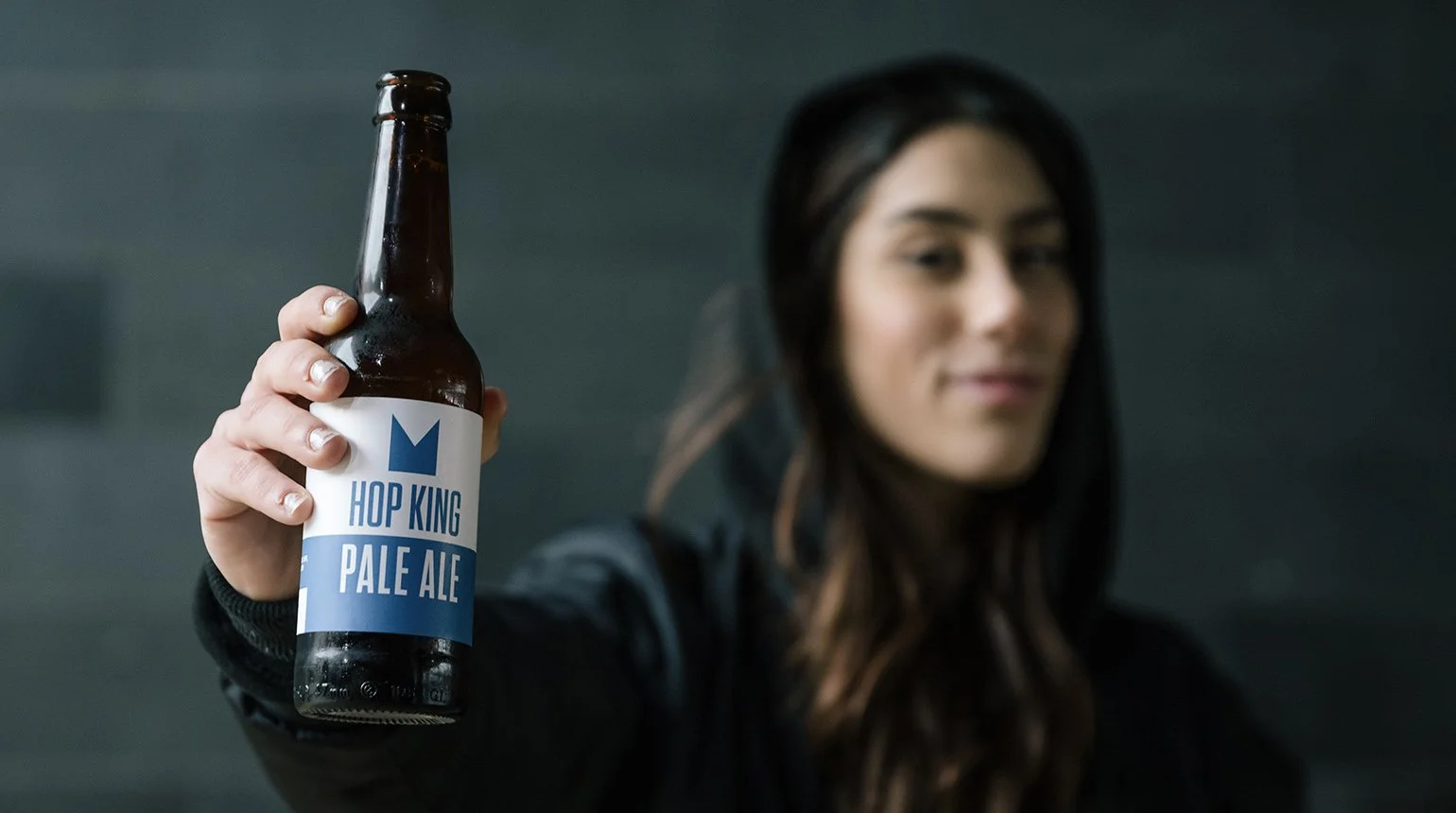
Inspired by the raw energy of skateboarding I crafted a visually striking brand identity for Hop King. The logo, characterized by a sharp edged crown emblem and bold typography, embodies the brand’s edgy and dynamic nature. The colour palette of white and blue reinforces a clean and contemporary aesthetic, evoking a sense of freshness and authenticity.
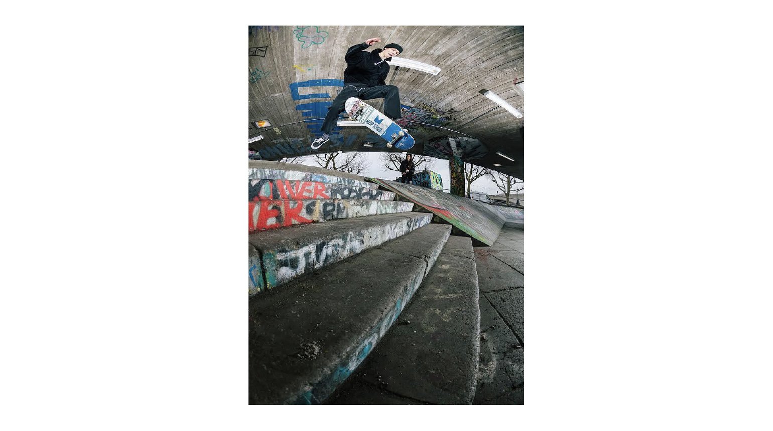
The cohesive visual identity extends to the beer labels, skateboards and merchandise - establishing Hop King as a trailblazer within the beer and skateboarding scene, while creating a vibrant and immersive atmosphere within the Hop Kingdom that captures the essence of the brand.
Role: Senior Designer (WMA)
My remit: Logo design, brand look and feel, guidelines, website design


